Medication Admin
Bringing ease to medication administration for clinicians

The Problem
The current med admin system presented a dated and unintuitive user interface that significantly hindered Clinicians’ efficiency.
Clinicians frequently report frustration due to the cluttered layout, poor visual hierarchy, and unclear task flows.

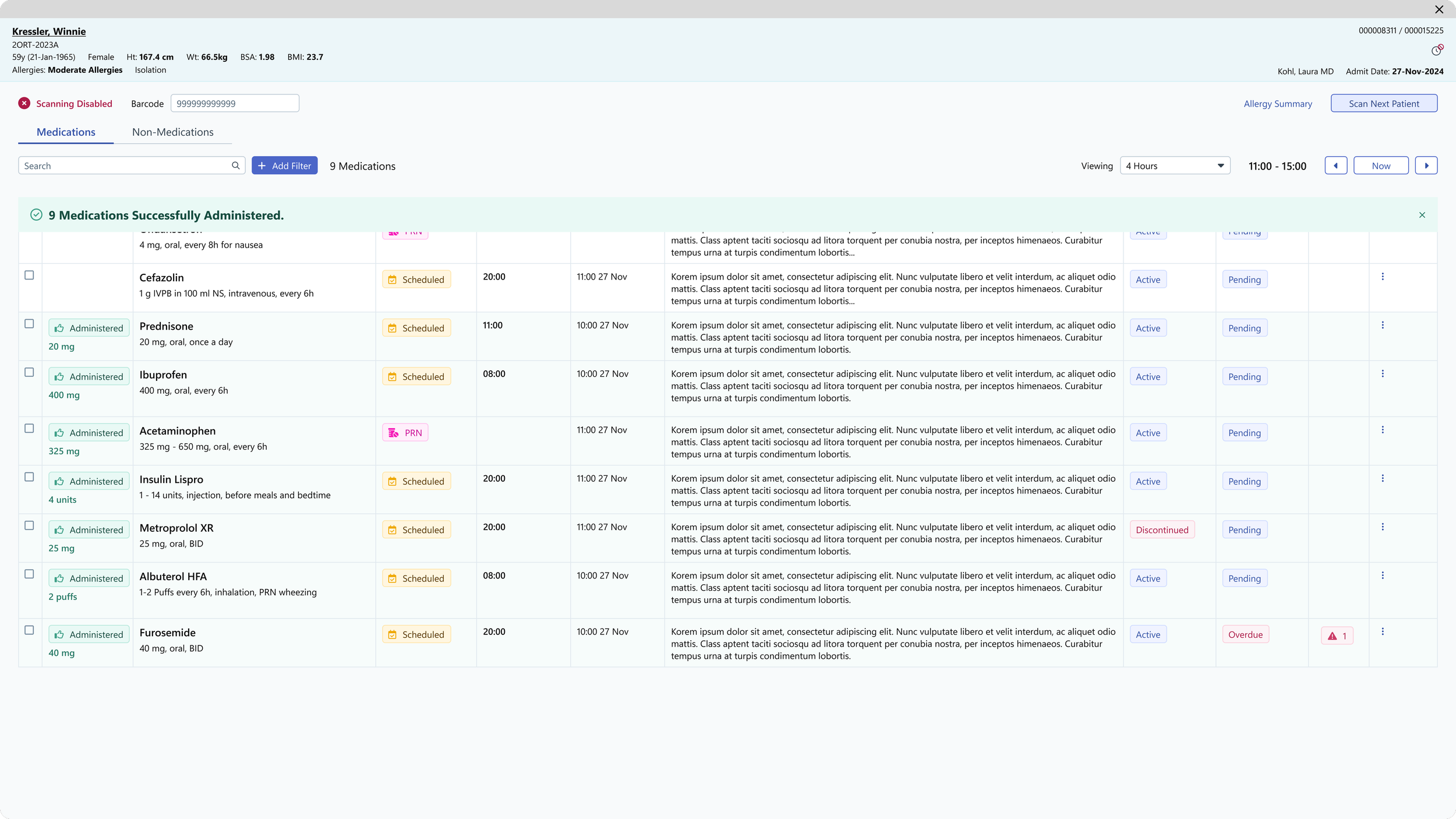
Medication List
Partial Matches Column


Critical actions—such as verifying doses, scanning medications, and acknowledging warnings—are buried within dense text blocks and repetitive UI elements, increasing cognitive load and the risk of error.

Medication Warning Dialogs

Mobile similarly had its issues with the dated interface and clunky unintuitive interactions.
The Project
Redesign the medication admin app with a modern, user-friendly interface for both Desktop and Mobile
Reduce user errors through clearer workflows and visual hierarchy
Enhance patient safety by improving accuracy and alert visibility
Increase clinician satisfaction with a more intuitive, efficient experience
Deliver a polished product that meets the expectations of healthcare clients
My Role
I was the sole Designer working on this project, alongside 2 Project Managers.
Mobile Redesign


Desktop Redesign