Clinician’s Hub
Creating a modern EHR portal for physicians to manage their patients


The Problem
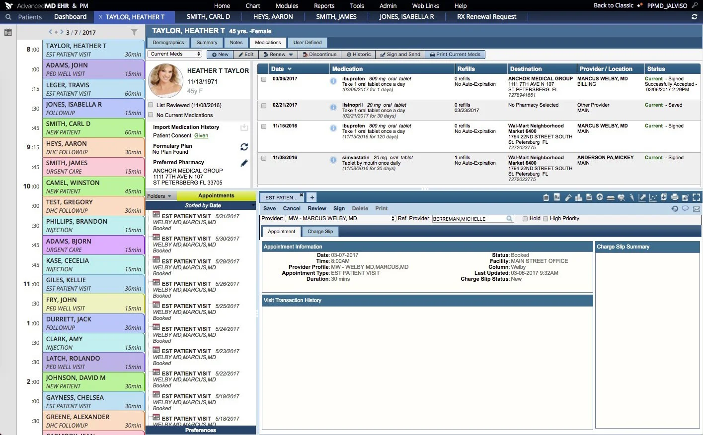
The existing EHR product felt outdated and difficult to use, leading to frequent complaints from clinicians.
Our software, originally “designed” by Engineers, hadn’t been updated since the millenium, leaving the current interface dated and stressful to use.
The Project
Discover what is truly happening in the medical industry and find opportunities to innovate and reduce clinician stress.
Understanding the existing EHR software landscape and improve our existing software to address user needs better than our competitors.
Created the Design System – Worked with my manager to establish a consistent and clear design framework
Designed Key Pages – Created the Tasking, Patient page, Schedule, and Dashboard pages
Ensured Alignment – Facilitated brainstorming sessions and maintained consistency across the entire product between myself and 5 other Designers
My Contributions
The Team
I was one of 2 Lead Designers, working alongside 5 other Junior Designers. As well as 3 UX Researchers.
Research

To ground our work in real-world insights, we conducted immersive field research by visiting five hospitals and shadowing 15 clinicians across a range of roles and departments. During these visits, we also brought initial design concepts to gather early feedback and better understand clinicians’ reactions and needs.This hands-on experience gave us a firsthand look at the daily challenges clinicians face, how they interact with existing EHR systems, and where their workflows break down or cause unnecessary stress.
Alongside this, we performed a thorough competitive analysis of major EHR platforms to understand industry standards, common features, and areas where these solutions fall short. By combining direct observation with market research, we uncovered critical pain points and unmet needs that current products fail to address. These insights became the foundation for our design decisions, helping us prioritize features and design patterns that would truly improve clinicians’ experiences and workflow efficiency.


Remote Brainstorming
I facilitated 10 remote brainstorming sessions with our team of 8 designers and UX researchers during the early concept phase. These sessions were intentionally creative and collaborative—several teammates shared how inspiring and genuinely fun they found them. Through guided discussions and shared sketching, we aligned on key ideas across the core product pages. This early alignment gave us a unified direction and design foundation, making it easier to later divide ownership while staying cohesive across the entire experience.


Initial Wireframes
Since this was an entirely new concept, we prioritized fast alignment over polished design work. Rather than investing time in high-fidelity mocks upfront, our focus was on quickly exploring and aligning on page structure, content hierarchy, layout, and shared design patterns across all key screens.
This approach helped our team of six designers stay in sync and build a strong foundation for the product experience.
The Designs
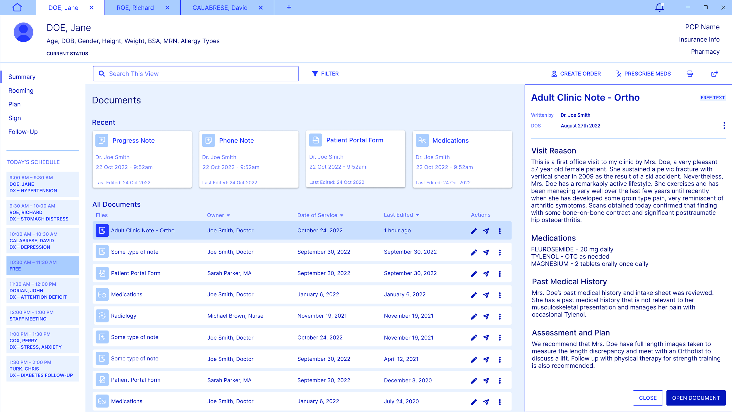


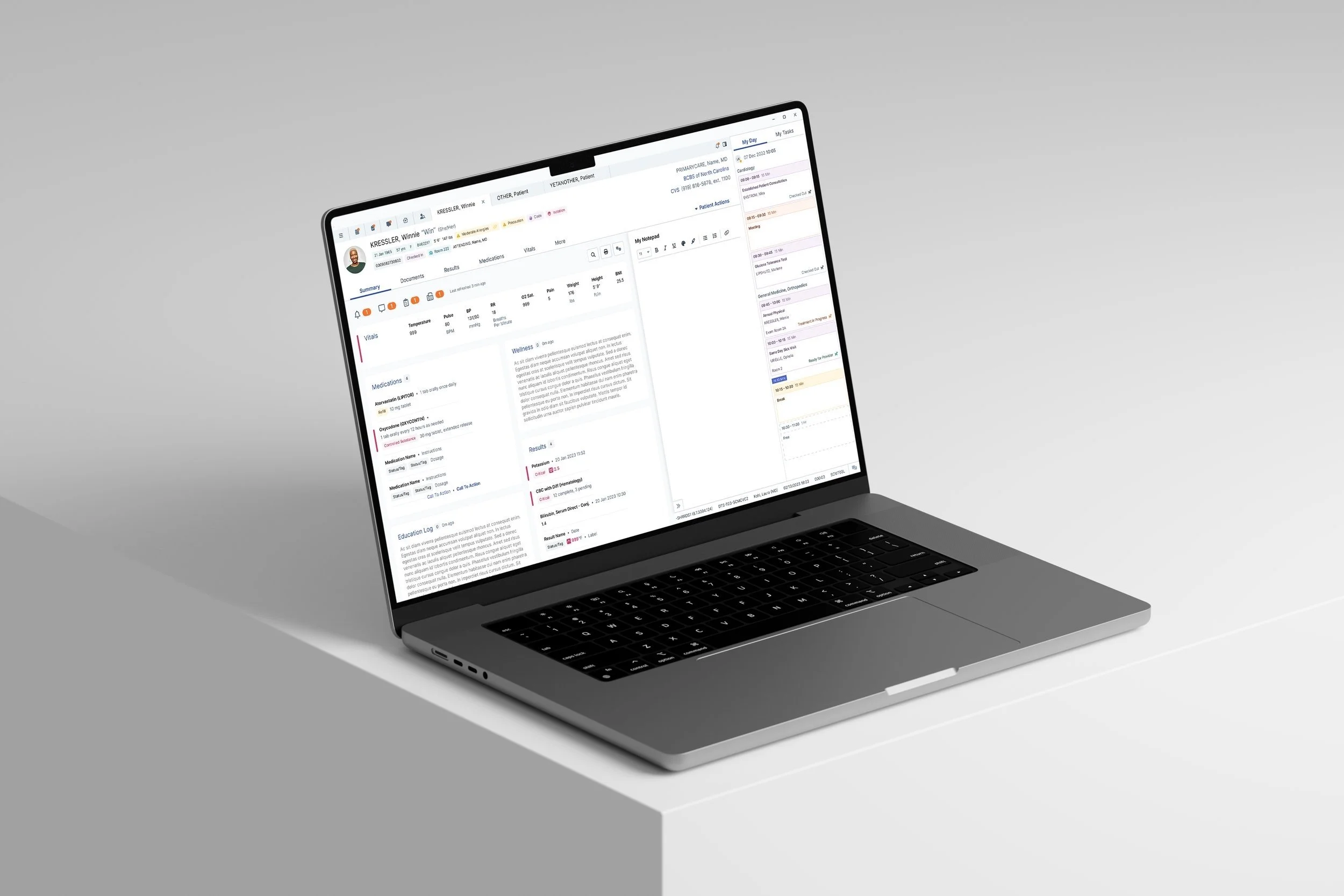
The Patient Page
The Patient Page is designed to help doctors access critical patient information quickly and efficiently. With everything in one place, they can stay organized and focused on providing the best care.
Comprehensive Patient Overview – View medical records, vitals, medications, lab results, and documents in a single interface.
Built-in Notepad – Jot down important notes without switching screens.
Integrated Schedule – Stay on top of appointments and avoid missed visits.
Streamlined Workflow – Designed for clarity and ease, ensuring a smooth review process.
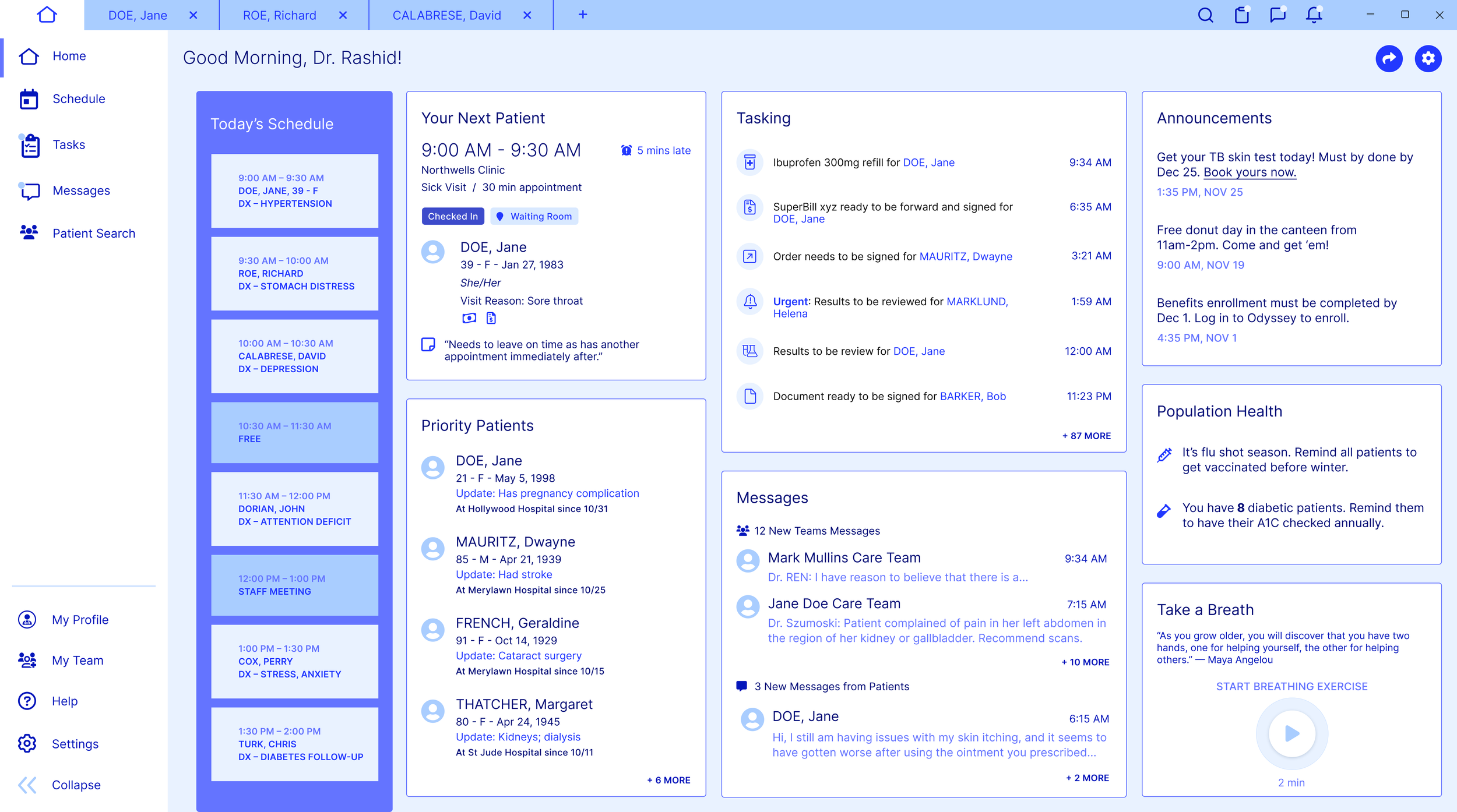
The Dashboard
The Dashboard provides doctors with a comprehensive view of their day, ensuring they stay organized and informed:
Mini Schedule – A quick glance at upcoming appointments.
Daily Tasks – A list of tasks to complete throughout the day.
Next Visit Preview – A mini patient summary for the upcoming visit.
Messages – Keep track of important communications.
Announcements – Stay updated on relevant news and updates.
Public Health Notifications – Alerts for critical health-related information.
Self-Care Reminder – A gentle prompt to prioritize well-being during a busy day.
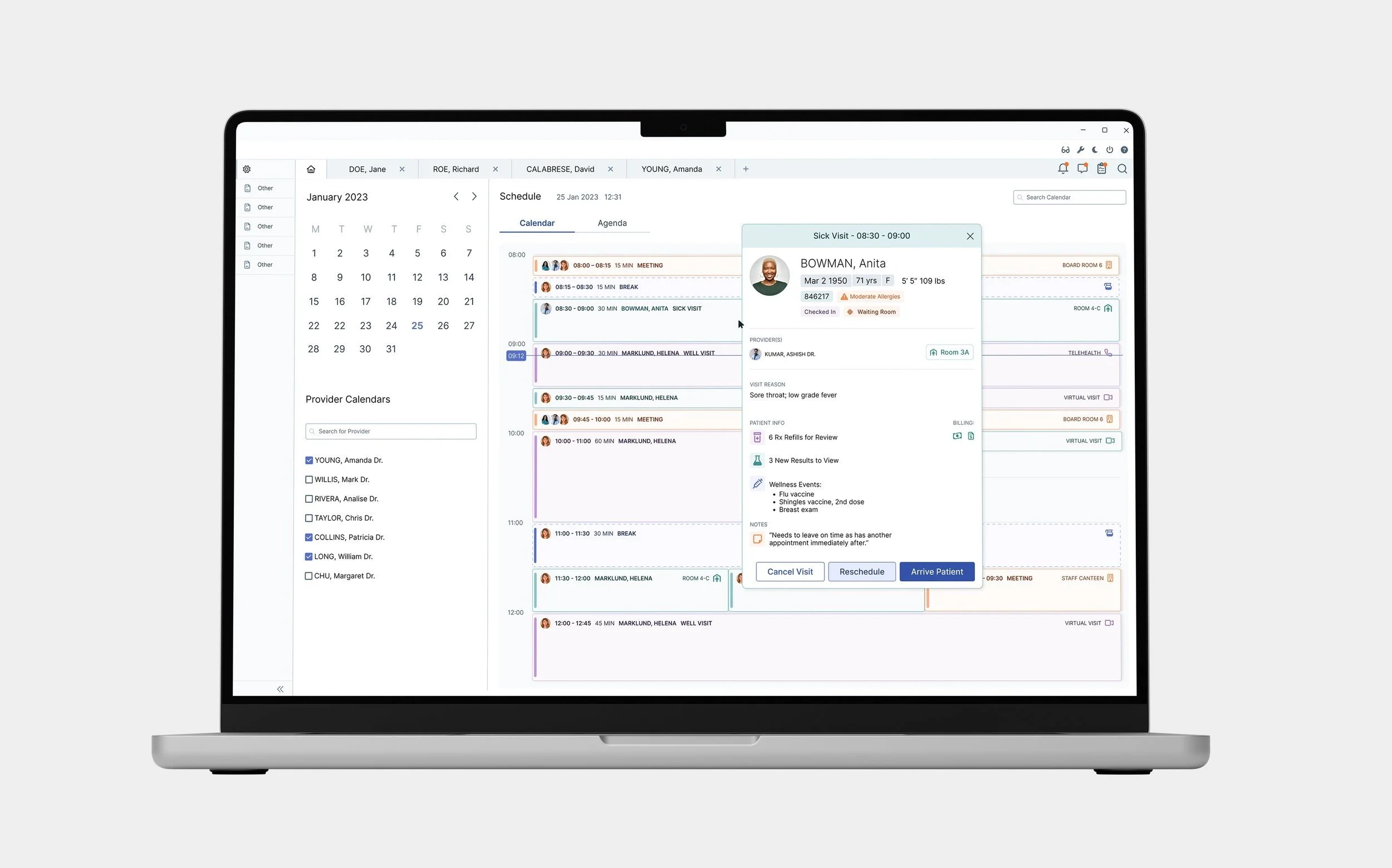
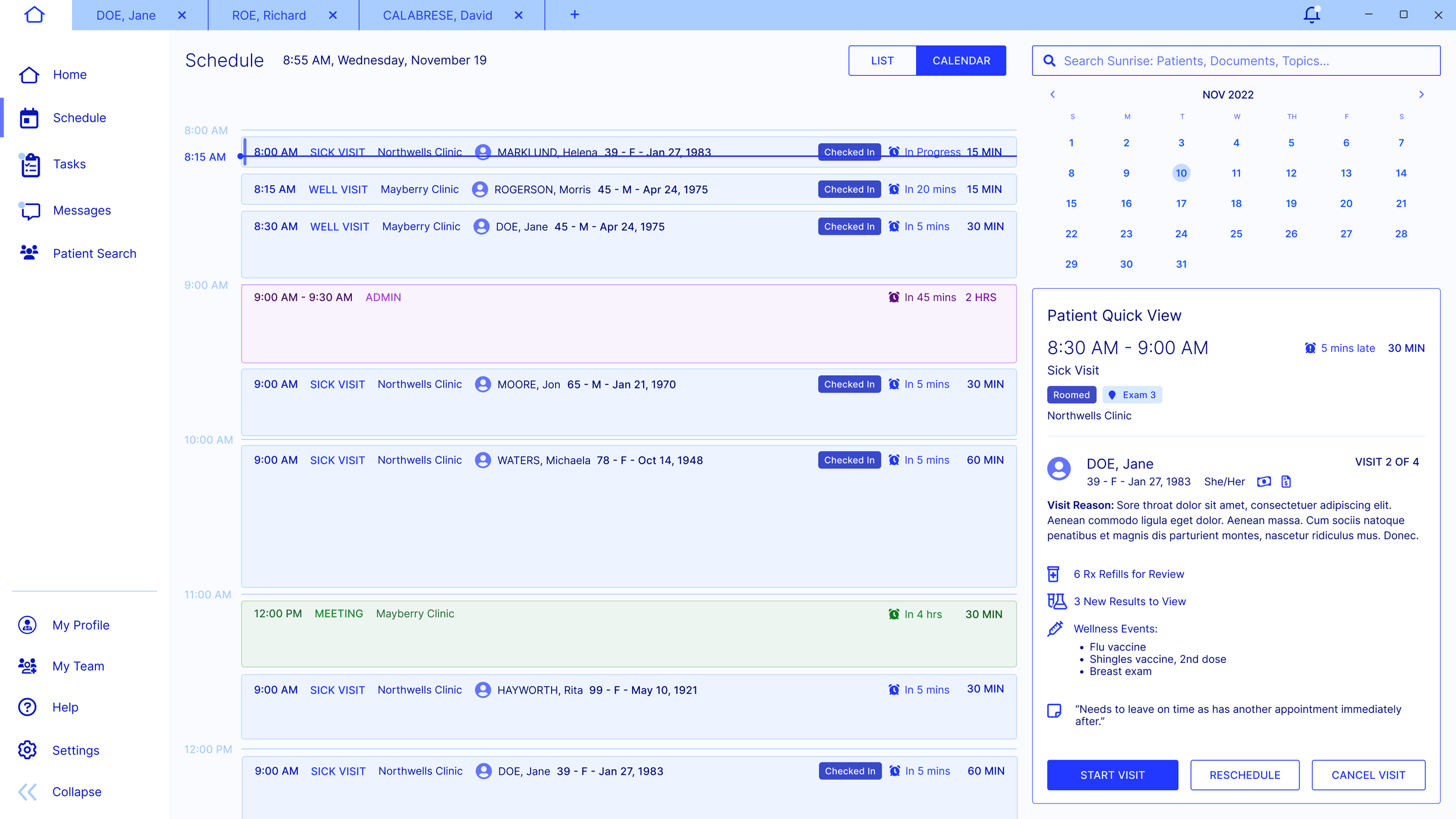
The Schedule
The Schedule Calendar helps doctors and nurses stay organized by providing a clear, color-coded view of their day.
At-a-Glance Scheduling – Quickly see appointment types and availability.
Color-Coded Organization – Easily differentiate between meetings, sick visits, and well visits.
Quick Patient Access – Click on a schedule item to instantly view patient details, including immunizations, medication refills, lab results, and notes from the previous provider.
Work-Life Balance – Identify gaps for downtime during a busy work day.

Tasking
The Tasking page helps doctors efficiently manage patient-related tasks while staying on top of their schedule. It ensures nothing falls through the cracks, keeping patient care smooth and organized.
Task Management – Sort through patient tasks like medication refills and other action items.
Schedule at a Glance – Keep an eye on upcoming appointments while handling tasks.
Efficient Workflow – Stay organized and ensure patient needs are met without delays.
Post-Redesign Pitch
This UX work represents a proposed redesign that, while not implemented in full, served as a valuable exploration of how our product could evolve. Ultimately, the company determined that the scope of change required was too significant for our current codebase.
Instead, we’ve taken a more incremental approach—modernizing the product page by page. As part of this strategy, I personally redesigned the Patient page, helping to move the software toward a more contemporary and user-friendly experience.
First Patient Page Redesign
This proposed redesign was part of a larger vision to modernize the product, but the project wasn’t approved due to the significant technical investment required. The layout was clean and spacious, but feedback noted that too much key information was hidden in collapsed cards.

Second Patient Page Redesign

In the approved, incremental redesign, I kept the cleaner design direction but expanded the card content to surface more information upfront. Though constrained by our legacy container and navigation, I improved visual clarity and introduced color-coded chips to make important data more scannable and accessible. Ultimately, this was also not used in production, and there have been no modernizations of the existing Patient Page.