Prescription Portal
Helping users to never miss a prescription refill

The Problem
20% of users were unclear when they needed to refill their prescriptions
15% of users were unable to figure out how to refill their prescriptions, or thought they had completed the task when they had not
The Project
Merge the current ‘Prescription Status Hub’ with the current ‘Refills Hub’ to make an integrated experience where users know when to refill and what the current status is of any prescription
The Goal
Make it easier for users to refill their prescriptions and track the status of them at the pharmacy
Simplify the UI and make it mobile-first so users can access it on the go
Test the designs within a 3 week timeframe
My Role
I was the Lead Designer, consulting with my Design Manager, along with 1 Visual Designer and a Research Team.
The Existing Site Experience
As part of the digital experience, 13 million users refill and manage prescriptions on the website every month. The Rx Refill hub and Status hub lived on different pages which splintered the experience.

The Research

I looked through studies the Research team had previously conducted around importance of certain data when it came to reviewing their prescriptions. I made sure to focus on these in my concepts.
Ideation & Wireframing


User Testing Results
With the large amount of information in the Prescription Hub, I slimmed down the content by highlighting pertinent info and concealing secondary details until a user expands them, so the experience worked well on a mobile.
We tested two concepts in the lab with our UX Research team, and the preferred design was the Concept B (below right video) for its simplicity, scannability and clarity.
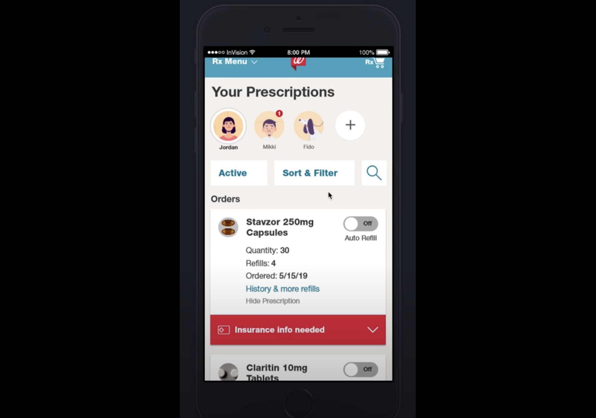
Concept A: Expanded Look / More data on cards
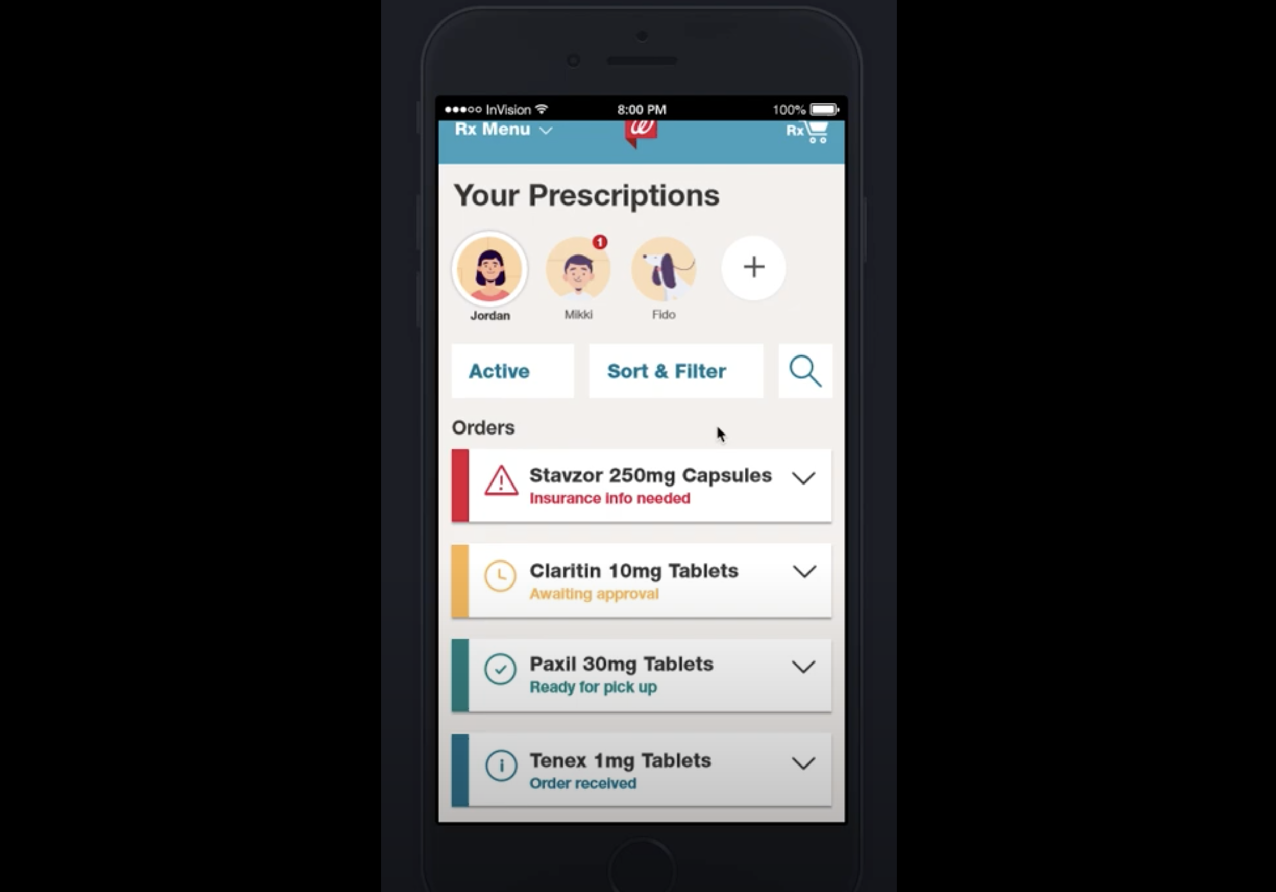
Concept B: Simplified mini card style
The Design Impact
4% conversion lift ($180 million annual revenue increase)
10% customer satisfaction score gain
50% reduction in page load time


The Final Designs on Walgreens.com
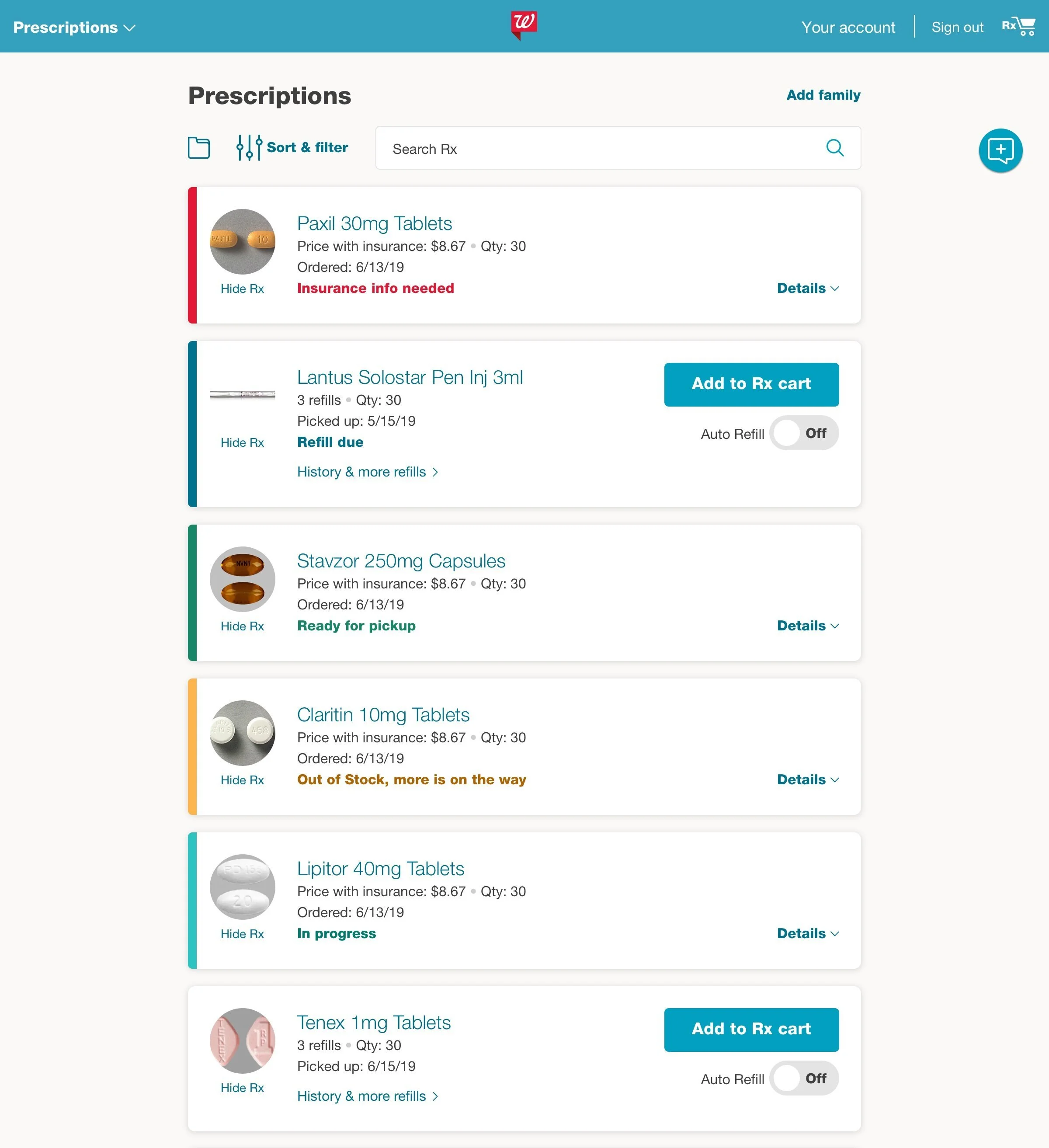
Some elements were changed once the experience went live, to reduce development time and work with data constraints.
These included removing the avatars which often do not exist for users, and expanding the height of the cards to include a touch more information, but still be expandable for full details.